DECONSTRUCTING CSS 3 MAKING OF THE CSS 3 SOLAR SYSTEM ANIMATION (KEYFRAMES AND SHADOWS)
In this article we continue our CSS 3 deconstruction of how Julian Garnier’s 3D Solar System was built. We’ll look at how to use CSS keyframe animations to make planets move in orbit around the sun, and apply dynamic shading to the planets that change according to their current position around the sun.
(If you’ve landed here from somewhere, you can go to the beginning of this tutorial on Deconstructing CSS: Making of the CSS 3 Solar System.)
Continuing on from where we left off: we had built an HTML file with only one element in it, and accompanying CSS to add a starfield background image and a semi-transparent image stacked on top of that to simulate the light of the sun, which will be in the middle:
<html>
  <head>
    <link rel="stylesheet" href="solar.css"/>
  </head>
  <body>
    <div id="universe">
    </div>
  </body>
</html>
Adding the sun to the solar system animation
Before we add any element to the universe, we’ll have to make sure we have a proper coordinate system. The universe <div> was appended to the <body> element using absolute positioning, and we’ll want to go back to relative positioning inside the universe, so that all position we provide will be relative to the universe. To do so, let’s add another <div> with relative positioning now:
<div id="universe">
  <div id="galaxy">
  </div>
</div>
The required CSS is:
#galaxy {
  position: relative;
  width: 100%;
  height: 100%;
}
All of our positions inside the galaxy element will now be calculated relative to it. Although the body, universe and galaxy elements are currently all of the same size, if we were to add headers or footers to the body later and without the galaxy element, all our positions would be calculated relative to body and things would go wrong.
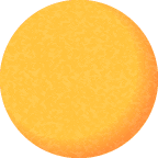
Let’s add a <div> element for the sun in the middle of the galaxy. The sun needs to be a circle, so we’ll need a way to turn our rectangular <div> into a circle. This can be done by setting its border-radius to 50%, which will turn any square into a circle. We’ll make it 30×30 pixels in size, and use margins to position it exactly in the center of the screen. We’ll also color the sun and add a nice blurry yellow box-shadow to make the it shine.
#sun {
  position: absolute;
  top: 50%;
  left: 50%;
  width: 30px;
  height: 30px;
  margin-top: -15px;
  margin-left: -15px;
  border-radius: 50%;
  background-color: #FB7209;
  box-shadow: 0 0 60px rgba(255, 160, 60, 0.4);
  z-index: 1;
}
That’s a tad small though, so let’s increase the width and height. But wait! Working in pixels isn’t a good idea, because screen sizes differ and the sun will be too small on large desktop monitors, and too big on mobile devices. Instead, it’s better to specify the width and height in em units. Why? An em corresponds to the size of standard text on the user display, which should scale nicely with the size of that display. But there’s something far more important: since all absolute sizes can be expressed in ems (widths, heights, margins, border radii etc.), you can use a powerful trick to scale them all at the same time using font-size. If we have this:
#sun {
  width: 1em;
  height: 1em;
  margin-top: -.5em;
  margin-left: -.5em;
  ...
}
and later on we add:
#sun {
  font-size: 24em;
}
Now all dimensions of #sun that were expressed in ems are multiplied by 24. What is more, that goes for the margins as well, so that the sun remains centered on the top/left coordinates we specified!
A sun with a single color looks a bit bald, so we’ll add a transparent PNG image with a texture:
We’ll set the image to cover the sun using the CSS 3 background-size rule again:
#sun {
  ...
  background-repeat: no-repeat;
  background-size: cover;
  background-image: url(data:image/png;base64,iVBORw0KG...AAASUVORK5CYII=);
}
The result is this:
Adding a planet in orbit using keyframe animations
We’ll now see another feature of CSS 3 in action, which is keyframe animations. Keyframe animations can be used to smoothly alter a CSS property over time. For example, if you wanted an element with class myelement to fade out over time, you would write this CSS:
.myelement {
  animation: 'fader' 2s linear;
}

@keyframes fader {
  0%   { opacity: 1; }
  50%  { opacity: 0; }
  100% { opacity: 1; }
}
First, the @keyframes statement is used to create an animation with the unique name fader. Inside the keyframes block, we create three keyframes: full opacity (at 0%, the start of the animation), no opacity (at 50%, halfway the animation) and full opacity again at the end of the animation. Opacity is just one of many properties that you can animate; we’ll later use keyframe animation to animate position and rotation.
Using the animation is as simple as adding the CSS rule animation to a class definition. You specify the animation name, how long the full animation should take to complete (in seconds) and a timing function. We used linear , which applies no easing, but you could use ease, ease-in or ease-out to make the animation speed up in the middle, beginning or end. CSS actually offers a bunch of different timing functions.
It’s also possible to separate the animation name, duration and timing function separately. Since we’ll have many planets sharing the same animation, this will be useful later:
.myelement {
  animation-name: orbit;
  animiation-duration: 2s;
  animation-timing-function: linear;
  animation-iteration-count: infinite;
}
We’re using animation-iteration-count here to have the animation loop indefinitely. You could also add the keyword infinite to the shorthand notation above.
Note that it is also advisable to include the vendor-specific prefixes -webkit-animation, -moz-animation and -o-animation, but we don’t have to do that anymore because we are using PrefixTree which adds these prefixes automatically as necessary. Moreover, modern browsers don’t need them anymore.
Since all planets in the CSS 3 solar system animation rotate around the sun in the same way (only with different orbit diameters), we can create a generic CSS class for planets. They also share some properties with the sun, so we can simplify:
#sun, .planet {
  position: absolute;
  top: 50%;
  left: 50%;
  width: 1em;
  height: 1em;
  margin-top: -0.5em;
  margin-left: -0.5em;
  border-radius: 50%;
}

#sun {
  background-color: #FB7209;
  background-repeat: no-repeat;
  background-size: cover;
  box-shadow: 0 0 60px rgba(255, 160, 60, 0.4);
}

.planet {
  background-color: #202020;
  background-repeat: no-repeat;
  background-size: cover;
}
We can now add a planet to our HTML:
<div id="sun">
</div>
<div id="mercury" class="planet">
</div>
This works, but now the planet sits in the middle, right over the sun. Before we can get it moving, we’ll have to give it an orbit, so let’s change the HTML to accommodate one:
<div id="sun">
</div>
<div id="mercury" class="orbit">
  <div class="planet"></div>
</div>
Now we’ve got an orbit-planet compound, which is the same for every planet. We’ll specialize by giving the orbit identifier #mercury, so that we can add planet-specific CSS properties later. First, let’s draw the orbit. We’ll give the orbit class a thin, semi-transparent border and use a border-radius of 50% to make it a circle. Specifically for the #mercury orbit, we’ll set the orbit size to 12em.
.orbit {
  position: absolute;
  top: 50%;
  left: 50%;
  border: 1px solid rgba(255, 255, 255, 0.2);
  border-radius: 50%;
}
#mercury.orbit {
  width: 12em;
  height: 12em;
  margin-top: -6em;
  margin-left: -6em;
}
Although the orbit is now drawn, Mercury still sits right in the middle of the sun. We can change that by giving mercury an offset within its orbit:
#mercury .planet {
  left: 0%;
  top: 50%;
}
This will put Mercury to the left of the sun, op top of its orbit line.
Let’s get Mercury moving around the sun! The trick to animating the planet it to apply an animation not to the planet itself, but to its orbit. Since the planet is contained within the orbit’s coordinate system, rotating the orbit will rotate the planet with it. We’ll create a keyframe animation for orbits, which smoothly applies a CSS transformation. This is new in CSS 3: you can not only animate the values of CSS properties, but you can apply a variety of transforms to your elements, translating, scaling and rotating them. In our case, we’ll define a rotation around the Z-axis to our orbit, which is the axis that sticks out of your screen, and we’ll have it rotate from 0 degrees all the way to 360 degrees.
@keyframes orbit {
  0%   { transform: rotateZ(0deg); }
  100% { transform: rotateZ(-360deg); }
}
With the animation defined, we’ll now apply it to the orbit class:
.orbit {
  ...
  animation-name: orbit;
  animation-iteration-count: infinite;
  animation-timing-function: linear;
}
We’ll define an animation duration for Mercury (we’ll define different durations for other planets, of course):
#mercury.orbit {
  animation-duration: 3s;
}
That’s it. Mercury is now rotating smoothly around the sun, with not a single line of JavaScript. It’s pure CSS:
Adding a moving shadow to a planet using animations and box-shadow
The CSS 3 solar system animation would be much more realistic if shading were applied to the surface of the planets not currently lit by the sun. If a planet is behind the sun, it will be fully lit from the viewer’s perspective. If a planet is in front of the sun, it’s darkened, and when to the left or to the right of the sun, it should be partially shaded. We can actually make this happen using more keyframe animations.
Our planet is now moving around the sun using a keyframe animation applied to its orbit, which leaves the planet itself free for another animation:
.planet {
  ...
  animation-iteration-count: infinite;
  animation-timing-function: linear;
}

#mercury .planet {
  animation-name: shadow-mercury;
  animation-duration: 3s;
}
Here, we’ve specified that all planets will have an infinitely looping animation, and for Mercury specifically, we’ve set it to be shadow-mercury. We can now define this animation:
@keyframes shadow-mercury {
  0%     { box-shadow: inset 0 0 20px rgba(0, 0, 0, 0.5); /* top */ }
  25%    { box-shadow: inset 16px 0 8px rgba(0, 0, 0, 0.5); /* left */ }
  50%    { box-shadow: inset 40px -20px 16px rgba(0, 0, 0, 0.5); /* bottom */ }
  50.01% { box-shadow: inset -40px -20px 16px rgba(0, 0, 0, 0.5); /* bottom */ }
  75%    { box-shadow: inset -16px 0 8px rgba(0, 0, 0, 0.5); /* right */ }
  100%   { box-shadow: inset 0 0 20px rgba(0, 0, 0, 0.5); /* top */ }
}
Inset box shadows are used to throw shadows on the planet. Since the planet has a border-radius of 50%, the box-shadows are also circular. When the animation starts (0%), the planet is assumed to be behind the sun and thus fully lit. At 50%, it’s fully shaded. When the planet passes in front of the sun, we have to flip the shadow from left to right, which we’ll do at 50.01%. Also note that it is important to define the box-shadow at 100% to be same as at 0% for CSS to calculate the intermediate shading properly.
We’ve exaggerated the shading here so that it’s clearly visible; in Julian Garnier’s implementation the shading is much more subtle:
Using the code we have now, we could easily add the remaining planets with their textures, orbit diameters and specific shading. However, it’s time to rotate the entire solar system so that we get a three-dimensional view. The planet shading will be much more realistic that way.
In the next and last part of this tutorial, we’ll implement some CSS 3D transformations!