DECONSTRUCTING CSS 3 MAKING OF THE CSS 3 SOLAR SYSTEM ANIMATION
The animation of the solar system in pure CSS 3 by Julian Garnier is an amazing piece of work. In this article, we’ll take an in-depth look at how it’s done. We’ll analyze the CSS piece by piece and show you what makes the solar system tick, and you’ll learn all about base64 image encoding in CSS, keyframe animations and CSS 3D transformations.
The animation below, as previously showcased on this site along with other pure CSS creations, was made purely in CSS (with a tiny bit of JavaScript to make the user controls work). Taking it apart piecemeal to see how it was built is an interesting journey into the possibilities of CSS 3. Don’t forget to have a look at other impressive CSS animations built by Julian Garnier.
In this CSS 3 tutorial, I’ll be building a series of pens on CodePen, constructing the solar system bit by bit.
Setting the stage: CSS Reset, Prefixtree and importing a font
Before we starting building any CSS for our animation, it’s always a good idea to reset the CSS styles that are provided by the browser, as they vary from browser to browser. Text fonts and sizes will be different, as will paddings and margins between elements. This is called a CSS reset and it gives you a clean slate to work with. Or, as Eric Meyer who coined the term CSS Reset puts it,
“The goal of a reset stylesheet is to reduce browser inconsistencies in things like default line heights, margins and font sizes of heading.”
The following code is not specific for the animation we’re about to build, and resets more elements than we’ll actually use, but it’s boilerplate code you should use in every CSS project.
html, body, div, span, applet, object, iframe, h1, h2, h3, h4, h5, h6, p, blockquote, pre, a, abbr, acronym, address, big, cite, code, del, dfn, em, img, ins, kbd, q, s, samp, small, strike, strong, sub, sup, tt, var, b, u, i, center, dl, dt, dd, ol, ul, li, fieldset, form, label, legend, table, caption, tbody, tfoot, thead, tr, th, td, article, aside, canvas, details, embed, figure, figcaption, footer, header, hgroup, menu, nav, output, ruby, section, summary, time, mark, audio, video {
  border: 0;
  font-size: 100%;
  font: inherit;
  vertical-align: baseline;
  margin: 0;
  padding: 0;
}

article, aside, details, figcaption, figure, footer, header, hgroup, menu, nav, section {
  display: block;
}

body { line-height: 1; }
ol, ul { list-style: none; }
blockquote, q { quotes: none; }
blockquote:before, blockquote:after, q:before, q:after { content: none; }
table { border-collapse: collapse; border-spacing: 0; }

* {
  -moz-box-sizing: border-box;
  box-sizing: border-box;
}
Another useful thing to do is to include the Prefix Tree CSS. Prefix lets you use only unprefixed CSS properties everywhere. It works behind the scenes, adding the current browser’s prefix to any CSS code, only when it’s needed. This’ll free us from remembering to put in all browser-specific prefixes. Note that in modern browsers, browser prefixes are thankfully increasingly disappearing, but to make it easier to support not-so-modern browsers, prefix tree saves us a lot of work. Let’s start by building our base HTML:
<html>
  <head>
    <link rel="stylesheet" href="solar.css"/>
  </head>
  <body>
    <script type="text/javascript" src="https://cdnjs.cloudflare.com/ajax/libs/prefixfree/1.0.7/prefixfree.min.js"></script>
  </body>
</html>
We’ve included references to prefix tree and our CSS file.
Let’s also set the base font for the animation project:
@import url(http://fonts.googleapis.com/css?family=Open+Sans:400,300);
body {
  font-size: 10px;
  font-family: 'Open Sans', sans-serif;
  font-weight: 300;
  background-color: #08090A;
}
Using the @import statement, we can have our CSS code load an external CSS file. Here, we are using a reference to a font on Google Fonts, which we can then use in our font-family CSS rule.
Adding a background image in pure CSS using Base64 encoding
The first thing we’ll want to do is add a starfield back ground image to the CSS solar system animation. There are three ways we can go about this:
- Add an
<img>element to the HTML and stretch it to cover the entire page - Add a background-image CSS rule (referring to an external image file) to the
<body>element - Add a background-image CSS rule using a base64-encoded image in the actual CSS to the
<body>element
Adding an <img> element to the HTML means an external file, which is another connection to the server that the browser will have to make in order to get the image data. Moreover, it’s an additional element that will clutter up the HTML, and we’ll try to keep the HTML as clean as possible. Since it’s a background image, there’s no need for it to have alt and title attributes anyway. Finally, while an <img> element can be stretched, it can’t be set to repeat itself.
Adding a CSS background-image rule referring to an external image also means a separate download, while encoding an image straight into the CSS using base64 encoding does not, so that’s the way we’ll go. We’ll use the following image. It’s 500×500 and about 15 kB in size:
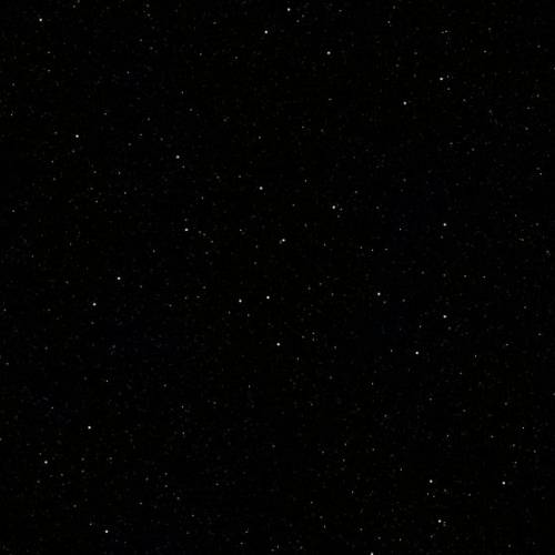
Encoding this image in Base64 encoding can be done using various online tools. Upload your image, and get a Base64 string in return. This code is then pasted into the CSS like this:
body {
  background-image: url(data:image/jpeg;base64,/9j/4AAQSkZJRgABA...RDcYAFYAKP/9k=);
}
(The Base64 string is actually about 18,000 characters long, but has been shortened in this example.)
This is one of the nice features that CSS 3 has to offer. You can now provide a data: instruction inside the url() function of background-image, where you specify the image MIME type (image/jpeg in this case, but you can use image/png and others as well) and the base64-encoded image data.
Here’s what we have so far:
The starfield image is repeated nicely over the entire page background.
Adding sunlight using a transparent PNG and background-size
In Julian Garnier’s demo, there is an additional background image that simulates the sun (when we get around to building the sun, that is) illuminating the universe from the center outward. To obtain this effect, an image with alpha transparency is used, which looks like this:

Let’s add a layer to our HTML to accommodate this background, which will stack over the starfield we already have.
<body>
  <div id="universe"></div>
</body>
Next, we’ll add CSS rules for the #universe <div>, making it stretch to fill the entire screen. The background image is once again added as a base64 encoded string, and it’s set to stretch to cover all available space. Note that we’re using another new CSS 3 feature here, namely background-size. According to the specification on W3C, you can set background-size to cover in order to scale the background image proportionally to be as large as possible so that the background area is completely covered by the background image where some parts of the background image may not be in view within the background positioning area, which is what we want. Another option is contain, to scale the image to the largest size such that both its width and its height can fit inside the available area. Finally, you can specify width and height percentages.
#universe {
  z-index: 1;
  position: absolute;
  overflow: hidden;
  width: 100%;
  height: 100%;
  background-position: center 40%;
  background-repeat: no-repeat;
  background-size: cover;
  background-image: url(data:image/png;base64,iVBORw0KGgo...RK5CYII=);
}
Now we get this:
Not bad for an HTML page containing only one element!
In the next part of this tutorial, we’ll have a look at applying keyframe animations and box shadows.