The webkit-specific CSS properties webkit-background-clip and webkit-text-fill-color can be used to add a fill pattern to a text string and animate it, degrading gracefully for any non-webkit browser. However, it’s possible to make this effect work in other browsers (including, without animation, in Internet Explorer) using a solution that combines CSS and SVG.
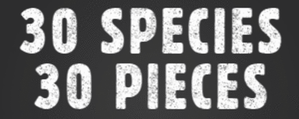
The web project Species In Pieces is a beautiful showcase of CSS 3 effects. There’s also a Making Of page on Smashing Magazine that explains how some of these effects were obtained. One of the little things that Species In Pieces does is show headers with an animated scratchy background. I’ve made a GIF image from the effect, since it will only work on Webkit browsers:
In pure CSS, this effect is obtained like this:
.animated-text {
  background: url('scratch.png') center center repeat;
  -webkit-background-clip: text;
  -webkit-text-fill-color: transparent;
  animation: scratchy .253s linear infinite;
}

keyframes scratchy {
  0% { background-position: 0 0; }
  25% { background-position: 0 0; }
  26% { background-position: 20px -20px; }
  50% { background-position: 20px -20px; }
  51% { background-position: 40px -40px; }
  75% { background-position: 40px -40px; }
  76% { background-position: 60px -60px; }
  99% { background-position: 60px -60px; }
  100% { background-position: 0 0; }
}
What’s going on here? The -webkit-background-clip CSS property takes the text content the element and uses it to mask the element background. The -webkit-text-fill-color property is then used to make the text transparent, so that the clipped background shows through the text. Finally, a repeating animation is used to animate the background texture. It’s a lovely effect, and the text remains available for search engines and screen reading assistants. It is unfortunate that it only works on Webkit browsers, but it can degrade gracefully to non-filled, non-animated text.
Text with an animated background using SVG
There is a way to make things better, though, and guarantee support in all browsers but Internet Explorer! (We will be able to fill text with a background color but not animate it, as Internet Explorer does not support CSS transforms, as we will see.)
Rather than using the proprietary Webkit CSS properties, we will specify a simple SVG image in our HTML and animate its background. Clipping is used to make sure that background is only seen through the text. Since the SVG image contains the raw text, that text can still be found by search engines and screen reading assistants.
Defining the background pattern
The first thing we do is define the pattern that we will use to fill the text. This can be done once, so that the same pattern can be shared by multiple SVG images:
<svg width="0" height="0">
  <defs>
    <pattern id="scratch-pattern" patternUnits="userSpaceOnUse" width="230" height="177">
      <image xlink:href="scratch.png" x="0" y="0" width="230" height="177" />
    </pattern>
  </defs>
</svg>
This SVG defines a pattern with unique id scratch-pattern, which loads the file scratch.png and uses that as a repeating texture for fills. The SVG itself has a width and height of zero so it does not appear. (It’s not necessary to create such a hidden SVG. You can add the pattern straight to your final SVG, but can be handy to be able to reuse the pattern definition.)
Defining the SVG text
Next, we create an SVG to hold our actual text:
<svg width="100%" height="120px">
  <defs>
    <clipPath id="clip-text">
      <text x="50%" y="50%" text-anchor="middle" dominant-baseline="middle"
      font-size="100" font-family="Passion One">SCRATCH MY TEXT</text>
    </clipPath>
  </defs>
  <g clip-path="url(#clip-text)">
    <rect class="scratch" x="-100%" y="-100%" width="300%" height="300%"
    style="fill:url(#scratch-pattern)"></rect>
  </g>
</svg>
What happens here?
- The SVG itself stretches across the screen and has a height of 120px.
- A rectangle is defined that fills the entire image and goes on well beyond its borders. It will be clipped, but it will be useful to have a rectangle that’s larger than the image itself, because our animation will move the rectangle back and forth. The rectangle is filled with the pattern we defined earlier.
- We define a clipping path (named
clip-text), shaped like the text we want to show. The text is placed in the middle of the clipping path (x = y = 50%), and we usetext-anchoranddominant-baselineto get the text exactly in the center of the space available to it. - The rectangle is contained in an SVG group
<g>, which is clipped using our clipping path. The reason that the clipping occurs in an other group is that we will want to animate the rectangle, while the clipping path stays still. To do the animation, we have given the rectangle a class ofscratch, which we can refer to in our CSS.
Creating a CSS animation
The beauty of an SVG image is that we can use pure CSS to animate parts of it. Since our rectangle now has a class of scratch, we can use that class to attach a keyframe animation:
.scratch {
    animation: scratch .25s linear infinite;
}

@keyframes scratch {
  0%   { transform: translate3d(0px, 0px, 0px); }
  25%  { transform: translate3d(0px, 0px, 0px); }
  26%  { transform: translate3d(-20px, -20px, 0px); }
  50%  { transform: translate3d(-20px, -20px, 0px); }
  51%  { transform: translate3d(-40px, -40px, 0px); }
  75%  { transform: translate3d(-40px, -40px, 0px); }
  76%  { transform: translate3d(-60px, -60px, 0px); }
  99%  { transform: translate3d(-60px, -60px, 0px); }
  100% { transform: translate3d(0px, 0px, 0px); }
}
Species in Pieces used the background-position property to animate the text background, but that doesn’t work with SVG. Instead, we can use CSS transforms to move the background, and that works in all browsers except Internet Explorer. Still, Internet Explorer does show the SVG with the clipped background, so our effect is partially supported there.
Encoding the pattern image in Base64
If you don’t want to include a reference to an external image in your SVG fill pattern, then you’ll be interested to know that SVG also allows you to provide images in base64 encoding. This was also required to get the animation to work on Codepen as shown below.
<defs>
  <pattern id="scratch-pattern" patternUnits="userSpaceOnUse" width="230" height="177">
    <image xlink:href="data:image/png;base64,iVBO...UVORK5CYII="
      x="0" y="0" width="230" height="177" />
  </pattern>
</defs>
Result: SVG text with animated background
This Codepen shows the result of our efforts: